
Work
Château d’Emptinne
Brand strategy & brand identity
Industry: Hospitality

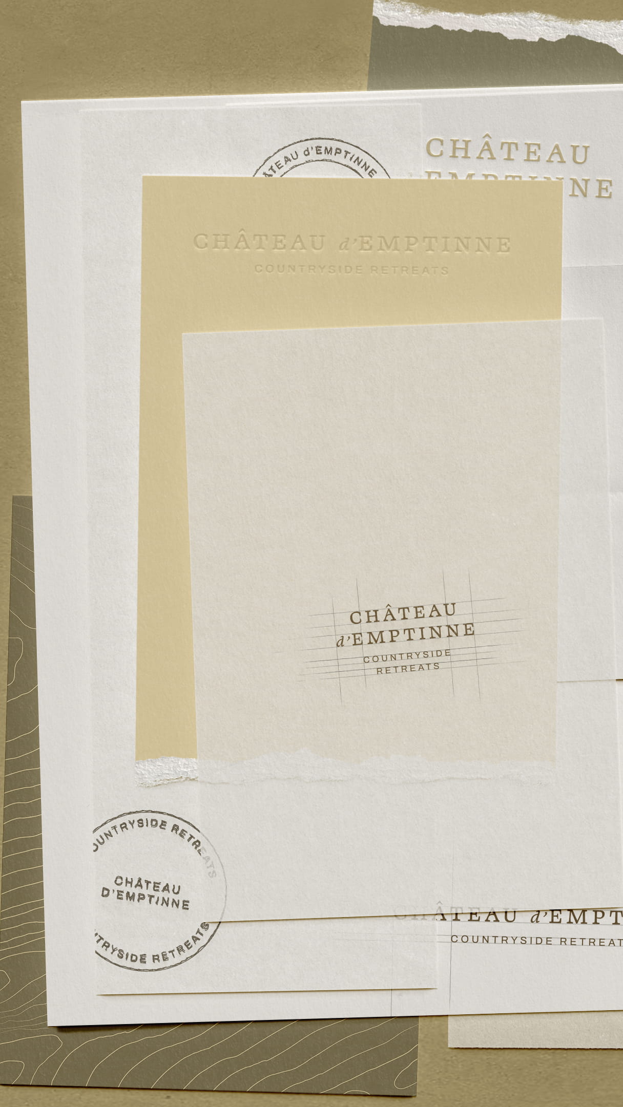
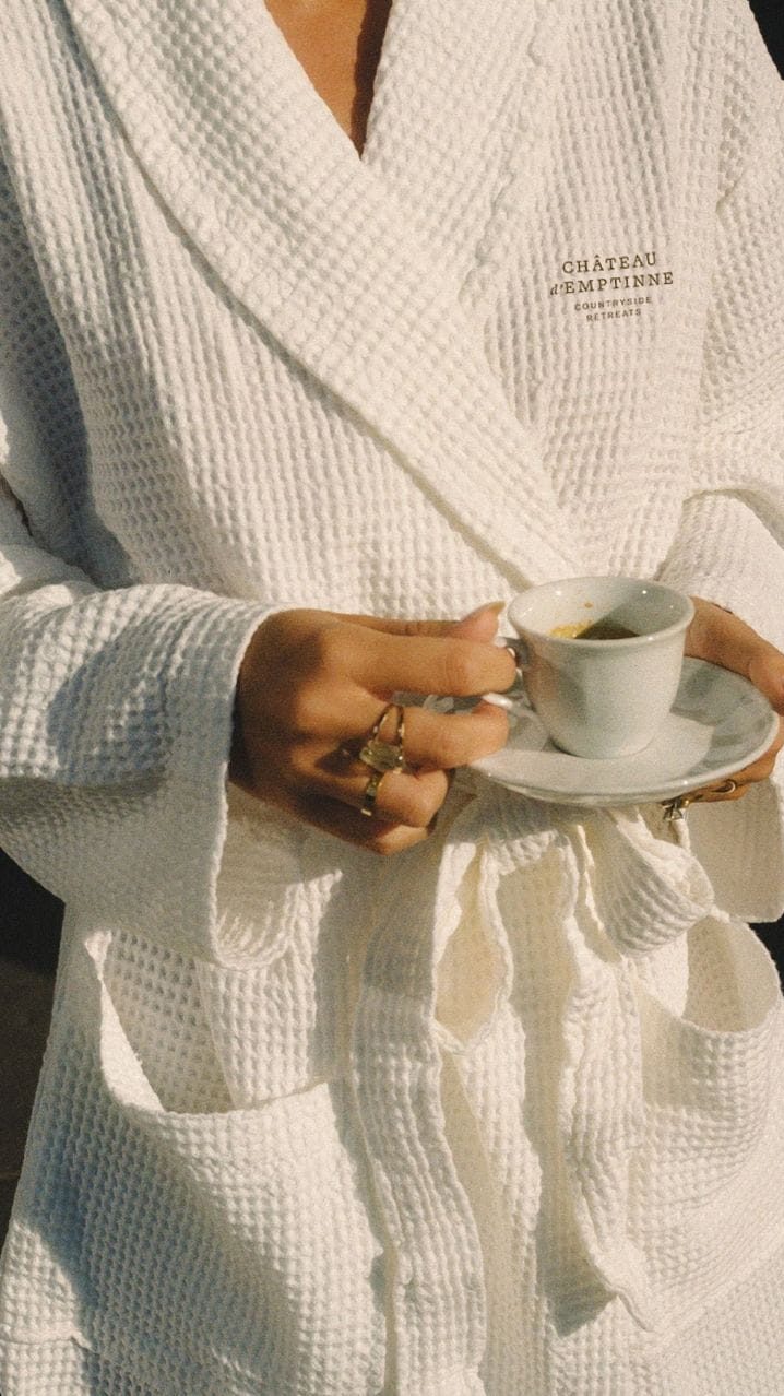


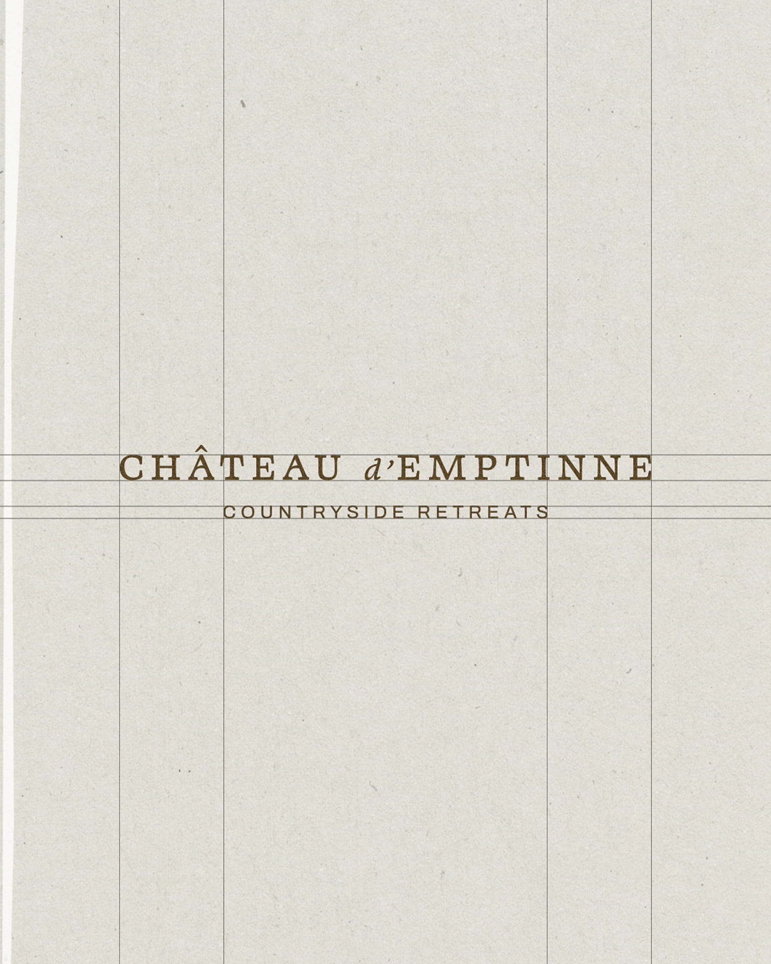
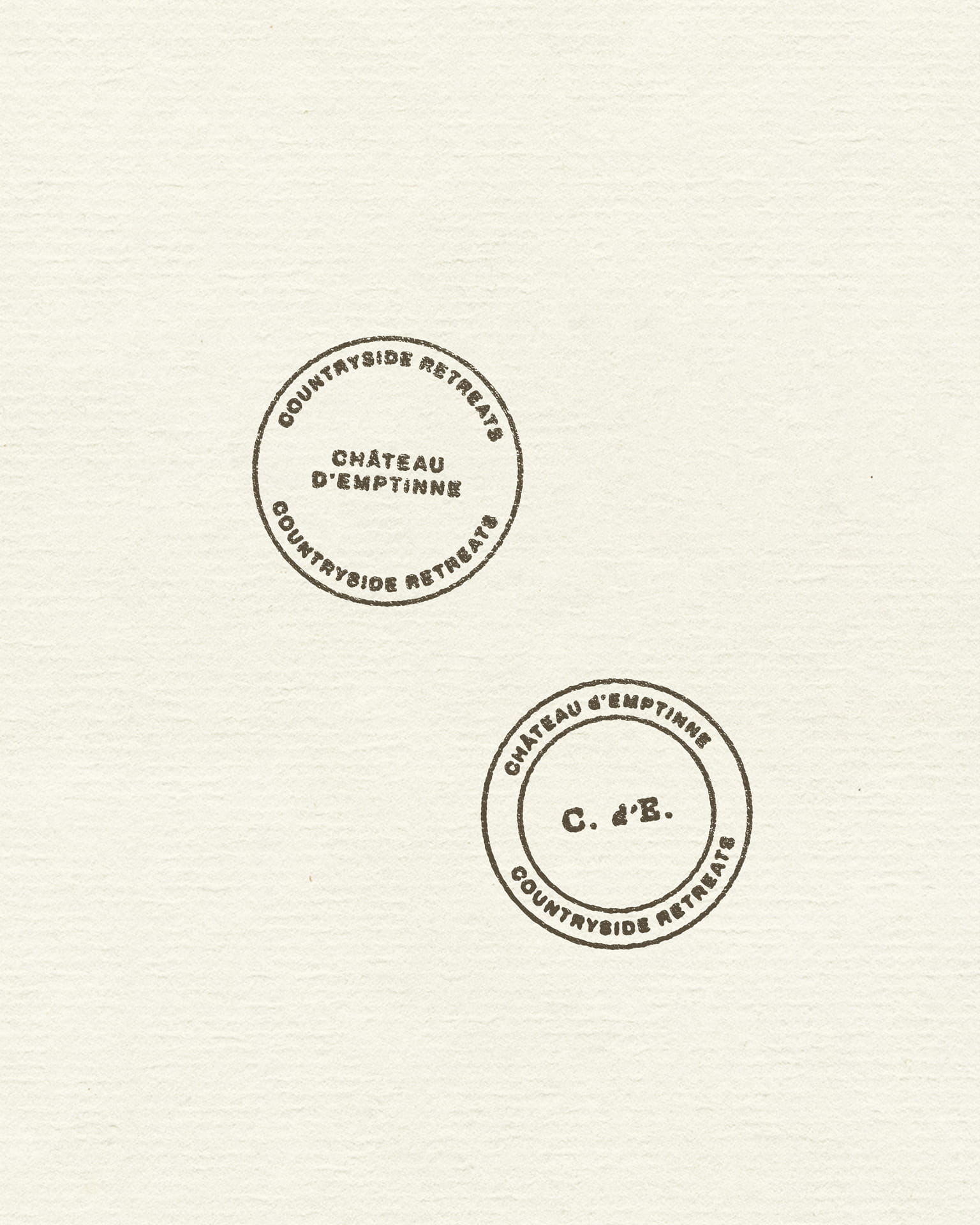
Château d’Emptinne is a historic Belgian château undergoing full renovation into an ultra-premium countryside retreat
The property had everything a guest could want: the architecture, the grounds, the atmosphere. What it needed was a brand capable of translating that quality into desire before the doors had ever opened, and a positioning strong enough to support premium pricing in a market where the competition is growing fast.
The work started with strategy. Before any visual decision was made, the focus was on understanding what Château d’Emptinne truly is, who it is for, and what separates it from the wave of renovated château properties appearing across Belgium and France. That clarity then shaped every creative direction that followed.
The identity was built around three ideas:
- the texture of the Belgian countryside
- the warmth of a place designed for gathering
- the quiet confidence of a property that does not need to announce itself
The colour system draws directly from the estate, mossy greens, warm linen, rich wood, river blues, avoiding the predictable visual codes that most château brands default to. Typography pairs a customised serif with a clean sans-serif, balancing elegance with the approachability the property genuinely has.
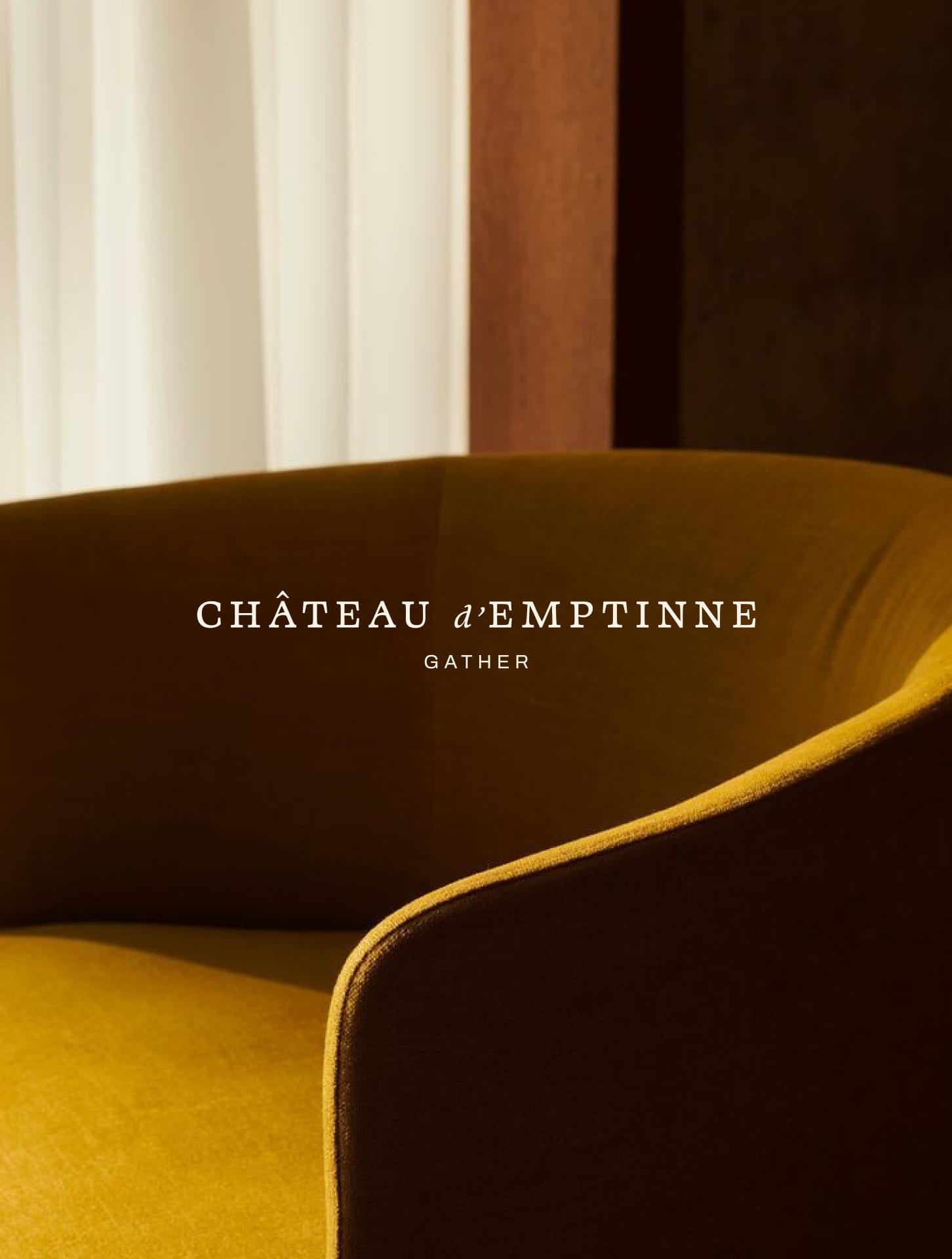
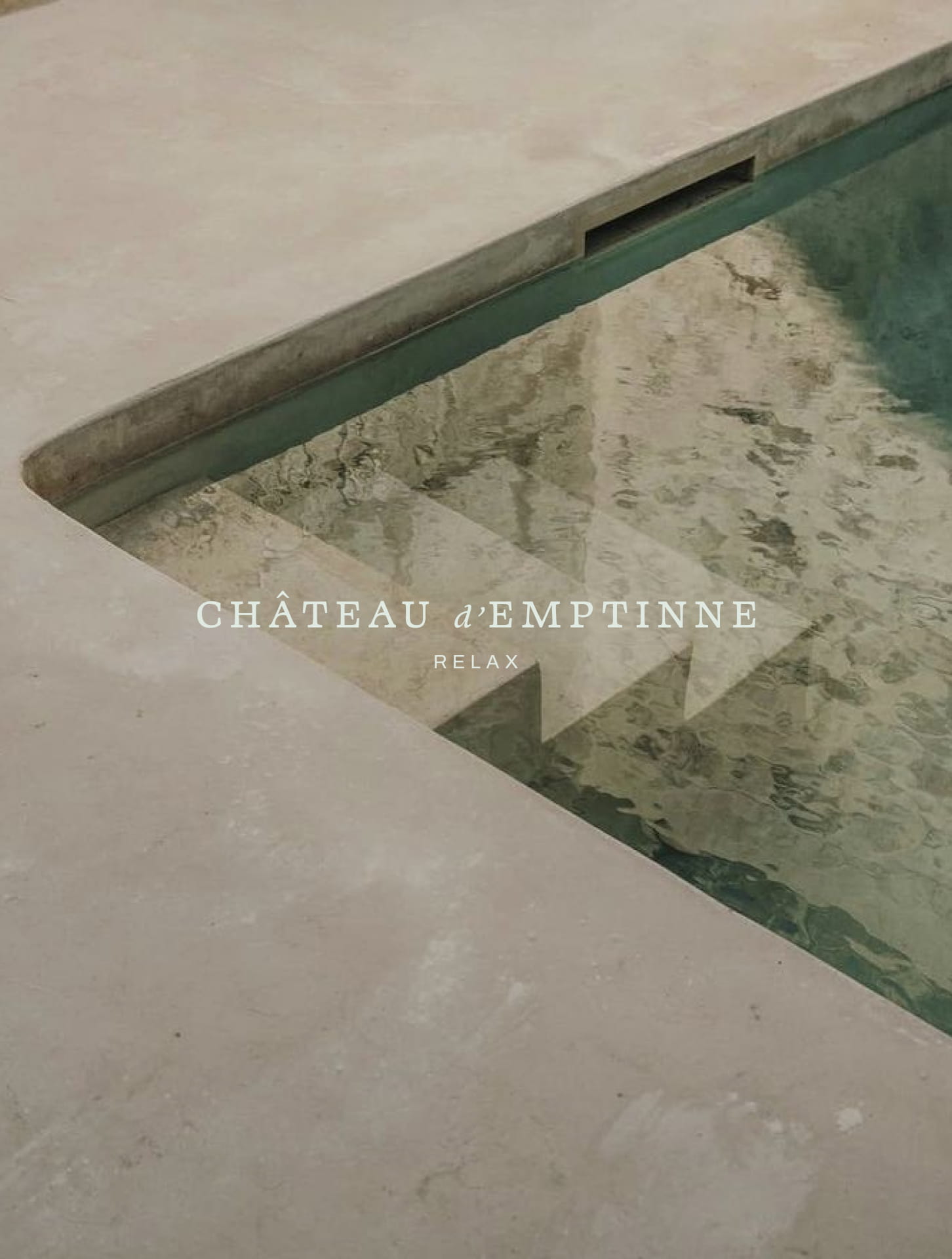
The brand architecture extends into three guest experience pillars, Gather, Relax and Wander, each with its own colour, imagery direction and logo variation.
This gives the property the depth to communicate with specificity across different touchpoints while holding together as a coherent whole.